Looks as good as it sounds…
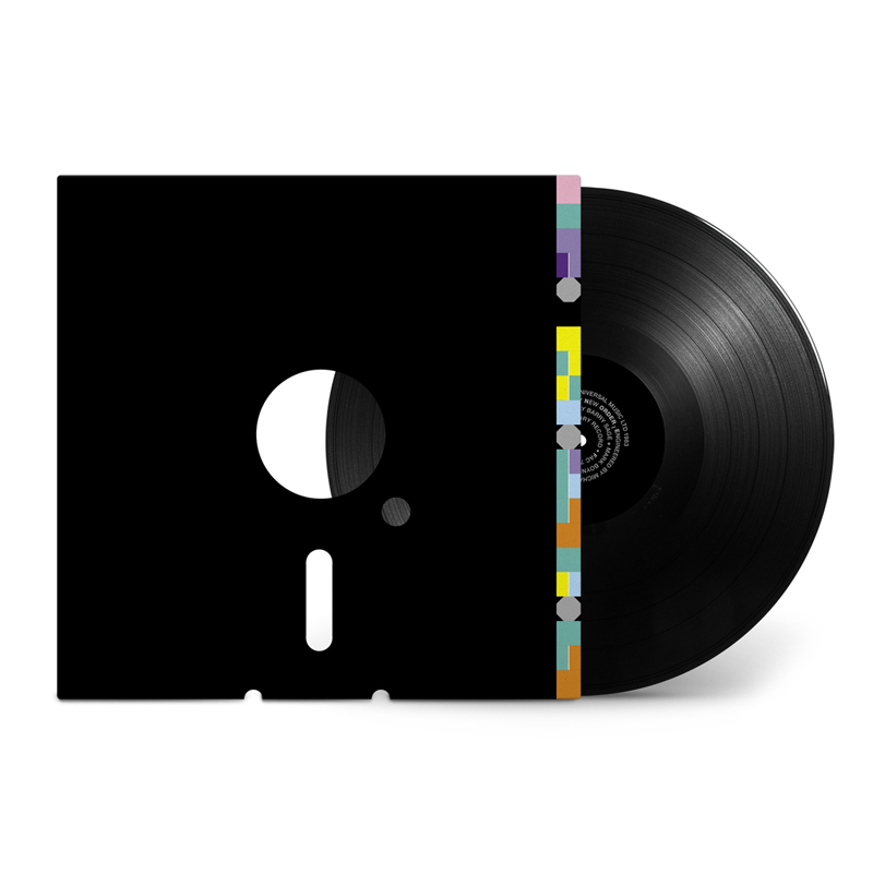
For me, this is the perfect record cover design… Peter Saville’s design for New Order’s Blue Monday single.
I remember coming home one day with this 12″ record tucked under my arm. At 13 years old, I was into computers and electronic music, and this design literally put the two things together into this highly desirable package. The sleeve, with the precisely cut holes, and exposed vinyl track mimicked the 5 1/4 floppy discs that I used to use on my BBC Micro (mostly to play games). The mystery of the coloured blocks and circles on the sleeve, and the spiral type on the label completed the whole package… It sounded as good as it looked, and I was hooked on its intrigue and simplicity.
Fair to say, this had a profound influence on my career aspirations at the time. Going to university to study law as my father wanted became so less appealing… Designing stuff people want to buy and enjoy was what I wanted to do. Forty years later, this timeless design remains a benchmark in simplicity and purity of an idea in a perfect package.
By Bob Pattni